Invitation card with a touch of glamour
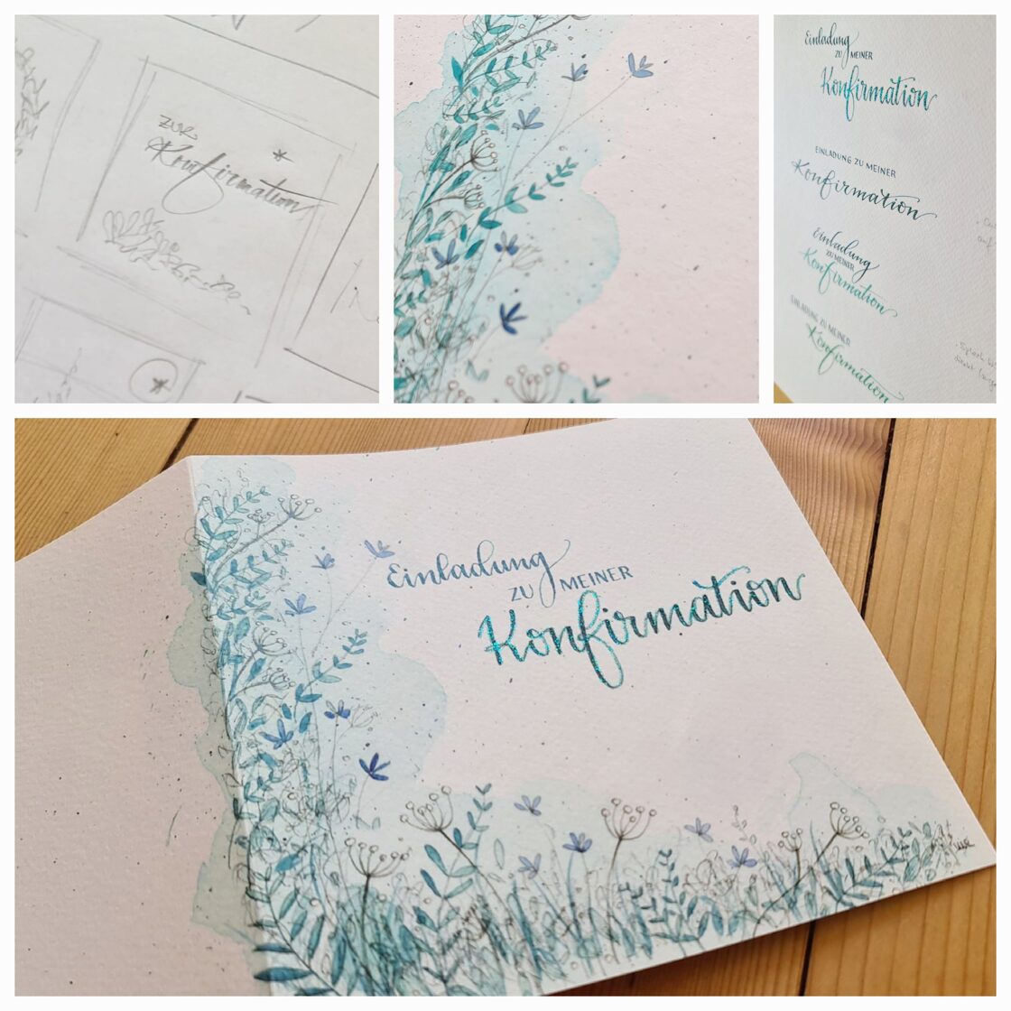
Right from the beginning, the main colour was decided to be petrol green, the rest took shape over the following months. The loose and slightly wild meadow flowers were combined with the chosen text-design and went to print in a small edition. The customer wanted a tactile, elegant paper, so a grainy paper in off-white with a grammage of 260 g/m2 was chosen. The motif ran all the way around the card – it didn't just stop at the edge, but continued across the fold to the back. The finishing touch was then added by hand: each individual card was embossed with the word ‘Konfirmation’ shimmering in petrol green. The invitation text on tracing paper was written by father and daughter together before the cards were sent out with handwritten addresses. A very personal invitation card with a touch of glamour, perfectly suited to the occasion.
After the confirmation, the proud father showed me a picture of his daughter. The young woman had added the icing on the cake to this beautiful commission herself: with an enchanting dress in the colour – petrol!
No comments
Leave a reply
Cart
Cart is empty.